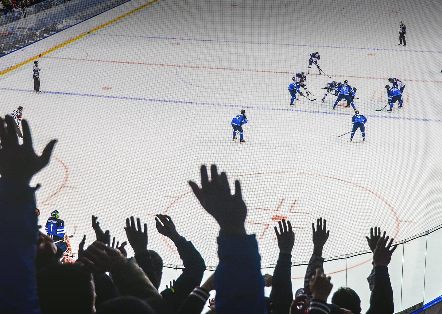
Last night I went to an ice hockey game at Madison Square Garden. It’s been years since I’ve been to a big sporting event, and I had an absolute blast. But while I was sitting there thoroughly enjoying the atmosphere, absolutely beaming, I started to draw some compelling comparisons to how we push users through a retail flow from a UX perspective and how an arena pushes fans through a game. Here are my favorite things that event organizers do that we can learn from:
Get them in fast and get them seated
This translates to me getting our users to the product that they want to buy as quickly as possible. In MSG, the signage is clear, your level/section and seat are clear on your ticket. The escalators only go up, and all traffic is walking in the same direction; signage is clear, there are ushers all around to help you, and you basically cannot mess it up. For UX, it’s all about wayfinding and our brand’s navigation structure. How good is your search? How good is your categorization? Is your categorization theory meta or micro? Is there a meaningful browse experience? Are you surfacing the most popular categories or most popular items? Information Architecture is something to be scrutinized if you want to get them in fast and get them seated.
Watch the Kiss Cam
During play breaks at a game, there is usually some great fun and lighthearted entertainment. Kiss Cam, Celebrity Cam, Bongo Cam, etc. To me, this translates to “do not let them get distracted from the task at hand,” which at MSG is being and staying at the game. If everything just went quiet during the commercial breaks, the entire stand would stand up and go and get a beer; kids would get bored and ask for the candy; the bars and restrooms would gather huge lines, making the whole experience tiresome. For UX, it’s all about not distracting your user from their task. If you want them to checkout, remove all distractions. Many brands remove their header nav entirely in the checkout process.
Selling beer at the hotdog stand
Back in the day, you had to line up twice, once for a hotdog and then again for a beer at another counter. But just like in good UX, arenas have realized that the best way to upsell is to merchandise items that work together. Make the second item in the cart a no-brainer. Amazon is the most prime example of pre-bundling items together to make the upsell only one click away. Women’s fashion retailers put looks together: if you’re looking at a dress, you can add shoes to match. The questions we need to ask our clients are, are we promoting an upsell, how are we doing it, where are we placing it, and what is our promoted content methodology?
Single direction restrooms
I love this one so much. In the Madison Square Garden arena, there is a one-way entrance and a one-way exit for the restrooms. I know this sounds bizarre, but I love this experience. Compare it to the worst restrooms experience (which is at an airport – when you arrive at airport restrooms, the entrance corridor is narrow, and you often arrive with several bags making an awkward entry experience. Inside the restroom, the individual stall doors often open inwards, making it impossible to enter with your bags and then somehow jimmying the door closed back behind you with bags inside. To wash up, you have to put your handbag on a wet surface to wash your hands, and then to exit, push past the same queue of people with your bags, who also have their bags). In MSG, they shepherd you in and shepherd you out. What can we take away from this? Remove all bottlenecks. Remove frustrating hoops users have to jump through to get to their destination. Get rid of popups (tune in for my ‘Why popups are terrible UX’ article coming soon) that users have to exit out of in order to complete their journey, remove all carousels, remove mixing alternate product content before you have completed the current product’s content; just remove all annoyances and bottleneck experiences.
One-way escalators on the way out
And finally, once the game is over, there is only one way out. All the escalators are all moving in one direction – down and out. Patrons literally cannot go the wrong way. This seems like a perfect metaphor for the checkout flow. Many of us are highly versed in this practice: everyone knows about navigation being removed. But analyzing your conversion flow has its benefits, and there have been cases I have seen that can encourage users to pause and go off and search elsewhere (if shipping costs anything at all if there is a too-prominent coupon code box). Even having to type in your own credit card number these days with all the other alternatives can be enough to turn someone off. How long has it been since you’ve gone through your checkout flow with a fine-tooth comb?
Next time you have a seamless IRL experience, it might be a good opportunity to consider any take-aways you can bring to your e-commerce experience, and if you can’t draw the comparisons yourself, let us take a stab at doing a critical assessment of your flow, we’re experts.
To learn more about how Photon can help you build an effortless user experience, connect with our digital experts today.